
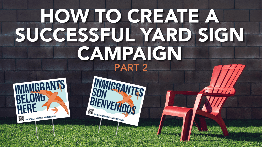
In thinking about how to write this blog post, I realized I couldn’t fit all the advice I had into just two parts. The good news is that you’re going to get a lot more information and practical tips from me. The bad news is that I now have to write a total of three blog posts. You’re welcome.
The first part of this series gave you an introduction and summary of the campaign. The second will give you an outline of the strategic work we did to build the campaign. The third will describe the tactical steps we took to launch the campaign.
What was the strategy for the campaign?
Abby Muro, the Executive Director of the Walla Walla Immigrant Rights Coalition, is a very smart person. She’s the daughter of immigrants; her parents were farmworkers who navigated citizenship. She’s also highly educated; she has a master’s degree from the University of Washington. And, most importantly, she’s thoughtful and has an excellent intuition about leadership.
Abby didn’t want a campaign that told people how to think; she wanted a campaign that invited people to feel. She wanted it to be warm and welcoming, a campaign that gave allies a way to visually stand with immigrants and skeptics a fundamental premise they couldn’t refuse.
For my bilingual readers, you may have noticed that the signs are not a direct translation. That is on purpose.
The ultimate goal was to make immigrants feel more welcome in Walla Walla through our target audience of white allies. This meant that the message had to work for immigrants and white allies alike, but the action-takers, meaning the people who would plant this sign in their yard, would primarily be white people who wanted to align themselves with the immigrant community.
Our strategy was bilingual from the start: one statement for allies that immigrants belong in Walla Walla and, in Spanish, that immigrants are welcome.
Finally, our campaign strategy was never meant to end with the yard sign. The yard sign was a key part of our launch, and most of our efforts and budget went to that at first. But we knew this campaign would always reach further than front yards. So, while the strategy focused on the yard sign for the initial design, we always had an eye towards next steps. As you’ll see in the rest of this post, and in part three, every decision assumes the campaign will shift and expand.
How did we work with the artists?
In my first post, I mentioned that we worked with two different designers. What I didn’t describe is how we worked with them.
First of all, the relationship with the artist is tantamount to any successful campaign. It is crucial that you can give direct, honest, and compassionate feedback to your artist at all times.
The first designer we worked with is someone I have recommended for years. Andrea Dimond is incredibly skilled in infographics, logos (she designed my logo, in fact!), and nonprofit work. I asked her if she could support us in our campaign and she offered to donate her time.
Andrea worked hard, through multiple versions, working from a short design brief. She worked alongside us with the monarch butterfly imagery and was still on board when we shifted to the Vaux’s Swift. She designed several versions that the team at Walla Walla Immigrant Rights Coalition discussed and just couldn’t agree on. After trying a few variations, we decided her design style didn’t fit our needs and we needed a different artist. I called Andrea to give her the news over the phone instead of over email.
Andrea was awesome. Even though she had donated her time, and had gone back and forth through several versions, she was very understanding and gracious about our decision to move to a different designer. This experience re-taught me a lesson that I never stop learning: relationships need to be at the center of all of our work.
Left without a designer, we needed to find someone else. I didn’t have a personal connection with an artist experienced in this style, but I had seen immigrant justice artwork on Just Seeds in the aesthetic we liked, so I looked there. I found one in particular and found the artist, Luz Ashby, on Instagram. I messaged her and was delighted when she replied that she was interested in helping us.
I had learned a lot from our work with Andrea. We had clarified key aspects of our campaign and I knew the next step was to give Luz everything she needed to start working.
What did we include in the design brief?
Our design brief ended up being a Google Doc with four tabs, totaling over 20 pages. Was it too long? Yes. Did it work? Also yes.
One: Design Specifications
The cornerstone of the campaign was the yard sign, but we knew it needed a life beyond corrugated plastic. The design brief stipulated we needed an 18”x24” landscape yard sign, but that we wanted a central image or graphic that also worked as a circle or square. This way, we could fit it in a social media icon, sticker, pin, window decal, or any other idea that came up in the future.
Two: Text Requirements
Walla Walla Immigrant Rights Coalition is a bilingual organization. Their events have interpretation (either from English into Spanish or vice versa) and their collateral is always bilingual. Any large-scale campaign we conducted would have to follow those values of accessibility. From the jump, we were clear: this design needed to work in English and in Spanish with the specific language we provided.
Three: Look and Feel
The central premise of this campaign is that you belong in Walla Walla. Living in the politically diverse region of Eastern Washington, we didn’t want the visuals to be aggressive or off-putting. We wanted an iconic, simple, beautiful image that would speak to people’s hearts.
Four: External Examples
This was a critical piece of the brief, as we looked through other examples of artwork that we liked or, more importantly, didn’t like. We included links and specific reasons for both. This not only helped us communicate with the artist, but also get aligned within the organization about what we were looking for.
Five: Internal Examples
Since we had a few versions with Andrea, we had specific feedback on each of her designs. I was able to insert images from Andrea’s work and include the feedback we gave her, how she adapted the design to fit them, and ultimately the reason why we realized she wasn’t a good fit. I even included the monarch butterfly designs that we moved away from at the very beginning. I had even tried my hand at designing something on Canva (which, trust me, no one wants me to design for them) that centered on the typography, and kept the bird imagery secondary.
Six: The Why
We picked the Vaux’s Swift for so many reasons, many of which I outlined in the previous blog post. The main reason is birds’ formation, how they work together. If the designer included multiple birds, I wanted her to understand the dynamic of their flocking technique. In addition, the campaign narrative is emotional, and I wanted the designer to have that in her mind as she created the typography alongside the imagery.
Seven: Research
The Vaux’s Swift, this particular species of bird, is special and we wanted our visuals to accurately reflect it. Our design brief had five images, all collected from the National Audubon Society. I found images of the Swift from all different angles, giving many options to the artist for representing this particular bird.
With that, we had the building blocks for the initial campaign. We sent off the design brief, and when we received her drafts, we were blown away. We had a few minor tweaks that were more logistical than anything else. Our edits were as follows:
One: Bolder text. As a yard sign, we wanted this to be visible at a glance. Her first version had a thinner font, which we suggested making bolder.
Two: Add the organization name and a QR code. While the signs would have worked without it, this helped direct people to the organization and identify who had made these signs. People are more willing to support local organizations, especially in rural communities. We wanted people to know this was a homegrown campaign and not one developed by a fancy design firm in Seattle (no shade to fancy design firms in Seattle).
Three: Adjusting the colors to align with our brand. I’m so glad we asked the designer to do this. Her first colors were gorgeous (truly, we loved them), but as we thought about the campaign moving forward, we wanted to align it with the WWIRC brand, which has 4 distinct colors in the logo mark. This was a subtle way we could connect it with our brand without using the logo itself.
I hope this in-depth description of our design process was helpful. In part three, I will go into implementation: how we launched the campaign, how we distributed signs, and how we’re looking ahead to what’s next.


Leave a Comment